
The data is the collection of information of all such cases is called data.
Data can be anything that share the information's about such object, like- your daily routine, your study, your breakfast, your marks, your game scores etc.
Organize the data in a systematic manner and then interpret it accordingly. Sometimes, data is represented graphically.
There are many ways to represent the data in graphically-
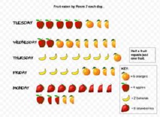
A Pictograph: Pictorial representation of data using symbols.
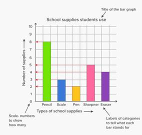
A bar graph: A display of information using bars of uniform width, their heights being proportional to the respective values.
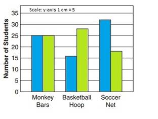
Double Bar Graph: A bar graph showing two sets of data simultaneously. It is useful for the comparison of the data.
Usually, data available to us is in an unorganised form called raw data. There are many way to organize the data.
Frequency gives the number of times that a particular entry occurs.
|
Subject |
Tally Marks |
Number of Students |
|
Art |
|
7 |
|
Mathematics |
|
5 |
|
Science |
|
6 |
|
English |
IIII |
4 |
The table made is known as frequency distribution table as it gives the number of times an entry occurs.
Sometime we got the data in different-different types and we have to arrange in the similar type, that's says grouping of the data. This kind of operation will happen we get in large number.
Consider the following marks (out of 50) obtained in Mathematics by 60 students of Class VIII:
21, 10, 30, 22, 33, 5, 37, 12, 25, 42, 15, 39, 26, 32, 18, 27, 28, 19, 29, 35, 31, 24, 36, 18, 20, 38, 22, 44, 16, 24, 10, 27, 39, 28, 49, 29, 32, 23, 31, 21, 34, 22, 23, 36, 24, 36, 33, 47, 48, 50, 39, 20, 7, 16, 36, 45, 47, 30, 22, 17.
|
Groups |
Tally Marks |
Frequency |
|
0-10 |
II |
2 |
|
10-20 |
|
10 |
|
20-30 |
|
21 |
|
30-40 |
|
19 |
|
40-50 |
|
7 |
|
50-60 |
I |
1 |
|
Total |
60 |
Data presented in this manner is said to be grouped and the distribution obtained is called grouped frequency distribution.
10-20, 10 is called the lower class limit and 20 is called the upper class limit.
Difference between the upper class limit and lower class limit is called the width or size of the class interval.
We can also represent the data in circular form, this type of representing of data is called Circle graph.
A circle graph shows the relationship between a whole and its parts. Here, the whole circle is divided into sectors. The size of each sector is proportional to the activity or information it represents.
A circle graph is also called a pie chart.
When we consider certain experiments whose results have an equal chance of occurring? The number of chances occurring is also says probability.
How can we predict the chances like a train will be late or not, in any game chances of winning and losing. Such experiment is called a random experiment.
Outcomes of an experiment are equally likely if each has the same chance of occurring.
Probability of an event
= Number of outcomes that make an event/Total number of outcomes of the experiment, when the outcomes are equally likely.
One or more outcomes of an experiment make an event.
Getting a result
Equally likely outcomes:
Linking chances to probability
Outcomes as events
Chance and probability related to real life
 II
II