
The word ‘statistics’ appears to have been derived from the Latin word ‘status’ meaning ‘a (political) state’. In its origin, statistics was simply the collection of data on different aspects of the life of people, useful to the share and show the information.
Collection of data can be anything, when the information was collected by the investigator herself or himself with a definite objective in her or his mind, the data obtained is called primary data.
And when the information was gathered from a source which already had the information stored, the data obtained is called secondary data.
There are various ways to present the data that collected, they can be represent with the tabular form or graphical and so on.
Consider the marks obtained (out of 100 marks) by 30 students of Class IX of a school:
10 20 36 92 95 40 50 56 60 70 92 88 80 70 72 70 36 40 36 40 92 40 50 50 56 60 70 60 60 88
|
Marks |
Number of students (i. e. the frequency) |
|
10 |
1 |
|
20 |
1 |
|
36 |
3 |
|
40 |
4 |
|
50 |
3 |
|
56 |
2 |
|
60 |
4 |
|
70 |
4 |
|
72 |
1 |
|
80 |
1 |
|
88 |
2 |
|
92 |
3 |
|
95 |
1 |
|
Total |
30 |
An ungrouped frequency distribution table, or simply a frequency distribution table.
The representation of data another representation of data, i.e., the graphical representation. It is well said that one picture is better than a thousand words. Usually comparisons among the individual items are best shown by means of graphs. The representation then becomes easier to understand than the actual data.
We will learn the following graphical-:
(A) Bar graphs
(B) Histograms of uniform width, and of varying widths
(C) Frequency polygons
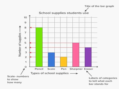
(A) Bar Graphs
We have already learnt and constructed many bar graphs. Here we will discuss them through a more formal approach. We recall that a bar graph is a pictorial representation of data in which usually bars of uniform width are drawn with equal spacing between them on one axis (say, the x-axis), depicting the variable.
The values of the variable are shown on the other axis (say, the y-axis) and the heights of the bars depend on the values of the variable.
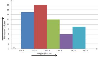
(B) Histogram
If there are no gaps in between consecutive rectangles, the resultant graph appears like a solid figure. This is called a histogram, which is a graphical representation of a grouped frequency distribution with continuous classes.
Also, unlike a bar graph, the width of the bar plays a significant role in its construction.
C) Frequency Polygon
Frequency polygons can also be drawn independently without drawing histograms.
Class-mark = Upper limit + Lower limit/2
We have learnt many approach for representing the data with graphical, tabular etc.
Now here we will learn about the Measuring tendency.
The mean (or average) of a number of observations is the sum of the values of all the observations divided by the total number of observations.
It is denoted by the symbol x read as ‘x bar’
Therefore, the mean x = Sum of all the observations/Total number of observations job. We use the Greek symbol Σ (for the letter Sigma) for summation. Instead of writing x1 + x2 + x3 + . . . + x30, we
x = Σ30i = 10 xi/30
The median is that value of the given number of observations, which divides it into exactly two parts. So, when the data is arranged in ascending (or descending) order the median of ungrouped data is calculated as follows:
When the number of observations (n) is odd, the median is the value of the

When the number of observations (n) is even, the median is the mean of the n/2
The mode is that value of the observation which occurs most frequently, i.e., an observation with the maximum frequency is called the mode.